Building FilerPK: From Website to Tax Workflow
Inside FilerPK: connecting a public website, tax tools, a client filing portal, and a staff CRM with React, TypeScript, and Cloudflare.
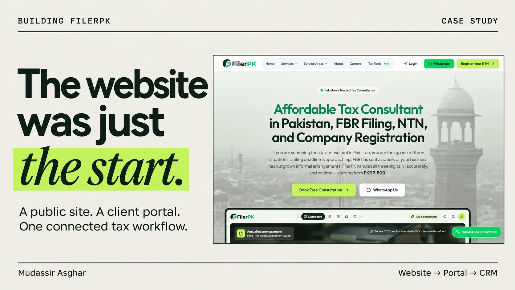
A consultancy website has two jobs. It needs to help someone understand a service, and it needs to make the next step feel manageable. For FilerPK, that next step can involve identity documents, income details, a payment receipt, and a conversation with the person preparing a return.
That is the interesting part of this build. FilerPK brings a public website, interactive tax tools, a client portal, and a staff CRM into one project. The interface gets someone through the door; the workflow has to carry their case forward.
Here is how I approached that connection, the engineering decisions behind it, and the parts that still need review before the entire journey can be treated as production-ready.
Project snapshot · November 2026
This is a development case study based on the current implementation. The cover is an illustration, the screenshot below shows the public FilerPK homepage, and the diagram explains the architecture. None of them includes private client records. Tax-rule sign-off and some production integrations remain open.
One project, three different experiences
I think of FilerPK as three connected experiences, each with a different definition of a good interface.
- The public website: explain tax and business services, help visitors find a relevant service, offer useful tools, and make it easy to request a consultation.
- The client portal: break a return into understandable sections, save progress, collect supporting documents, and show what happens after submission.
- The staff workspace: give the team a practical way to assign cases, ask questions, review documents, verify payments, and record filing progress.
The public side uses a midnight-slate and emerald palette, photography, and clear calls to action. The portal needs quieter forms and visible progress. The CRM needs filters, status information, and actions that remain easy to find during repetitive work. A shared brand should connect these experiences without making every screen behave like a landing page.

The architecture behind the experience
The source follows the Next.js App Router model with React and TypeScript. The deployment path uses Vite and Vinext to build for Cloudflare Workers. D1 stores structured application records, while a private R2 bucket holds documents. That distinction matters: a document record and the document itself have different storage and access needs.
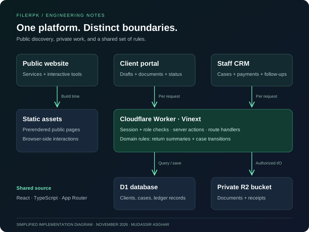
The Vite configuration enables prerendering for public pages. Pages that read cookies, including the portal and admin workspace, render per request. This keeps the public content and authenticated application on different rendering paths while retaining one source tree.
There is a similar separation inside the code. Page components assemble the interface. Server modules handle sessions, database queries, documents, and workflow actions. Pure modules describe calculations and status transitions. Keeping those rules independent of the UI makes them easier to inspect and test.
This is also a place where deployment details deserve attention. Having Next.js conventions in the source does not mean the production runtime is a conventional Node server. The Worker bindings and the Vinext build are part of the architecture, so they need to be considered when changing server behavior.
Turning a long return into a resumable workflow
The return wizard has nine steps: personal information, income, tax credit, tax deducted, wealth statement, expense, wrap-up, FBR access, and payment. Those steps live in a shared definition, so navigation and progress checks use the same ordering.
A single giant form would put too much work in front of a client at once. The section-based model gives each screen a smaller job. Personal information supports autosave, cases preserve progress, and the client can return to an existing draft instead of starting again.
The summary is another important decision. The return engine is a pure function, but the application runs it on the server using saved section data and stores the result on the case. The sidebar, wrap-up screen, and staff view can then read a common summary instead of maintaining independent calculations.
Wealth reconciliation is part of that summary. The code brings opening wealth, inflows, outflows, and closing wealth together and reports a difference. It also checks the previous year's case, because an already-filed return should constrain what can be adjusted next. This is where a form starts behaving like a business application: today's edit has consequences beyond the current input field.
A working calculator still needs a review gate
One of the most useful design decisions in this project is making review status explicit. The return engine has a reviewed flag for each supported rule set and warning codes for unreviewed rates, unsupported years, and income sources that need staff handling. Client-facing tax figures are gated while the rules remain unreviewed.
The public tools use a separate registry. In this snapshot, it contains 33 tools: three marked live and 30 marked for review. Review pages carry a draft banner, receive noindex metadata, and are excluded from the sitemap. The hub can show that a tool exists without presenting it as a fully reviewed release.
That registry also feeds related links and discovery surfaces. It is a small architectural choice with a useful consequence: the release state is recorded alongside the tool definition, rather than being scattered across page components.
The lesson: passing a calculation test and receiving professional approval answer different questions. Tests can check that code behaves consistently with its rules. They cannot establish that those rules are the right ones to publish.
The post is about that engineering boundary, not the tax amounts themselves. I would rather have an interface explain that a result needs review than display an authoritative-looking number without the necessary sign-off.
The handoff to staff is a state machine
Submitting a return is the start of a team workflow. The case model includes draft, submitted, in review, awaiting client, filing, filed, completed, on hold, and cancelled states. A shared transition function controls which moves are allowed for clients, staff, and administrators.
For example, a client can move a draft to submitted. Staff can move a case in review to awaiting client when something is missing, then back into review when the response arrives. Filed cases can move to completed. Reopening a cancelled case is an administrator action.
// A small excerpt from the case transition rules.
in_review: ['awaiting_client', 'filing', 'on_hold', 'cancelled'],
awaiting_client: ['in_review', 'on_hold', 'cancelled'],
filed: ['completed']
This makes a status more than a colored badge. It describes what can happen next and who is allowed to make that happen. The case screen adds document requests, messages, assignment, and a timeline around those transitions.
Payment handling belongs in this workflow too. A receipt upload is evidence to review; it does not automatically prove that payment is verified. The implementation distinguishes those states and includes a filing payment check with an audited administrator override.
The CRM extends beyond individual returns
A consultancy also needs to manage clients who arrive in person, enquiries that have not become cases, follow-up calls, and unpaid invoices. FilerPK's staff workspace includes these alongside the filing workflow.
Staff can add walk-in clients, filter cases by year and status, record follow-ups, issue invoices, and track expenses. Invoice balances derive from verified payments. Voiding an invoice is a distinct action, preserving the record rather than treating historical financial entries like ordinary editable text.
Import and export are especially practical details. The implementation validates imported rows, processes imports in batches, and builds CSV/XLSX exports in the browser. It also includes formula neutralization for CSV exports. These are less visible features than a dashboard chart, but they matter when the team needs to move an existing client book into the system or take records out of it.
Sensitive data changes the implementation
Identity and filing documents cannot be handled like public website assets. The project separates private documents from the marketing image library and serves document downloads through access-checked routes. Upload handling inspects file signatures and applies limits instead of trusting the filename alone.
The account code uses AES-GCM helpers for encrypted values and keyed HMAC for CNIC lookup. That supports matching an identity without using its plaintext value as the search index. Staff authentication also has a two-step flow; a session that has not completed it does not receive effective staff permissions.
These controls are implementation choices, not a claim that the application is immune to security problems. What matters architecturally is that access checks belong at the data boundary. Hiding a button or redirecting away from a page is not sufficient protection for the action behind it.
What the tests cover, and what remains open
The repository includes tests around slab boundaries, wealth reconciliation, unsupported years, status transitions, validation, cryptographic helpers, invoice behavior, and data imports. Those are good places to concentrate tests because a regression can change the meaning of a record or the next allowed action.
But implementation coverage and operational readiness are separate milestones. The project roadmap still lists professional approval of the return rules, production email setup, Google OAuth setup and testing, payment account configuration, and backup work. A payment gateway and an Urdu interface remain future expansion items.
I have not presented conversion lifts, customer counts, or performance scores here because this code review does not establish them. The concrete result is the implemented connection between the public site, saved client information, and staff operations. Validating that complete journey in production is its own piece of work.
What I would carry into the next build
- Design the handoff early. A submission screen is only useful when the next person has enough context to act.
- Give important states a shared definition. Step order, case transitions, and tool review status should not depend on whichever component happens to render them.
- Keep calculations separate from presentation. Pure functions make the rules easier to test, while a shared saved summary keeps different screens aligned.
- Build honest incomplete states. Unsupported years, pending review, missing configuration, and requested documents all deserve deliberate interface behavior.
- Make routine operations part of the product. Follow-ups, exports, payment verification, and maintenance are part of the daily experience.
FilerPK is the kind of project that pushes me to think beyond the page in front of me. The work connects a visitor's question to a client's draft, a staff member's review, and a recorded outcome. That continuity is the part of the build I find most valuable.
If you are planning a service website with a portal or internal workflow, let's talk about what happens after someone clicks submit.
Published on .